- Home
- >> Blog
Design With Intention, Part 3: Design and the Beauty of Constraints

Part 3 of 4 in a special series that contemplates how purpose and creativity merge when you “design with intention.”
Are the practical boundaries of commercial design limiting? Or liberating? Some of mankind’s greatest works are the result of finding extraordinary beauty within the established boundaries of different forms: the haiku of Bashō; the sonnets of Shakespeare; the operas of Wagner; the blues of B.B. King. Does creativity soar despite these limitations? Or because of them?
Is it fair to cite these examples in a discussion about commercial design? They’re not practical applications, objects to use, or structures to inhabit. They’re ephemeral moments of beauty, forms of art. The correlation is, however, that the power of these works derives from a structured format, a system that transforms words or sounds into meaning.
But: What if beauty is the function? People love beautiful places and spaces.
Consider the popular Infinity Bridge across the River Tees in England. This footbridge is an award-winning, structural engineering masterpiece bound by many constraints, but designed with rare aesthetic touches. With its asymmetrical arches, the bridge it reflects the infinity symbol, a sideways eight, on the water at night and its lighting display is interactive. A blue glow shifts to a white light and moves along with pedestrians, lighting the way as they cross. 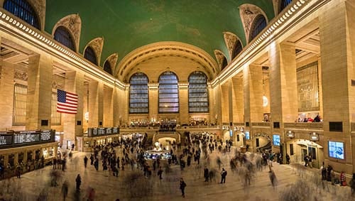 Consider another prime example. A research firm called New England Complex System Institute uses an algorithm that analyzes Twitter messages across Manhattan to generate a colored map showing the sentiment of each area in real time, with red indicating negative or unhappy, and green, positive or happy.
There are two major train stations in Manhattan: Penn Station, called “ugly” by many; and Grand Central, which most consider much more beautiful. At any given time, the map shows that people Tweeting in and around Penn Station are mostly red, or unhappy. Grand Central Station is always green on the map. That’s a direct function of the relative beauty of these spaces.
“Beauty is function. Humans connect to the world through emotion, and design without beauty is void of emotion. In the absence of beauty, we fail.”
– Jonathan Speh, Product Designer, Blogger (commenting on tenant depression caused by the lack of empathy in the design of Soviet housing blocks)
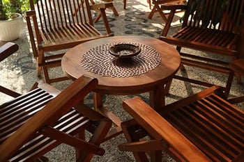 In interior and furniture design, limitations often revolve around materiality – cost, availability, durability, formability, sustainability, and of course, aesthetics. This is where the designer shines as a subject matter expert (SME). While heritage materials like stone and solid wood are well understood, these materials are increasingly scarce, as are the skilled craftsmen we need to convert them into design products. Other materials like concrete, solid surface, glass, aluminum, and steel have extraordinarily high carbon footprints, making them less attractive choices for projects with climate positive sustainability goals.
This is why designers and architects are looking with renewed interest at decorative and structural materials based on Earth’s most abundant renewable resource: wood. Structure, limitations, boundaries are all surmounted with creativity and skill. In furniture and built environments, having a vast material vocabulary is key.
In any commercial project, the designer must balance creativity with accountability, materials with functionality, practicality with ethical choices. As materials SME, the purposeful designer can master this puzzle with insights into sustainable materials that allow the creative muscles to flex while still meeting the parameters of a commercial project. Be on the lookout for our next installment, “Balance: Mindful Design, Mindful Materials,” and learn the secret to solving the form/function puzzle.
As you lead the discovery process with your clients and develop successful projects, we hope you remember our fun refresher about designing with intention. We invite you to learn more about how ARAUCO Prism® TFL can help. Visit www.prismTFL.com to search designs, download software assets, use the Room Studio visualizer, and request samples. Samples are always free to qualified A&D professionals. To keep your professional credentials current, we also offer credit-approved CEUs.